


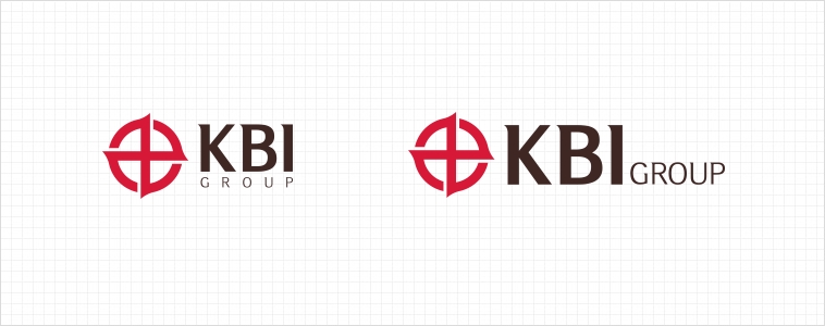
Symbol & Concept


The logo is the representative visual presentation for KBI, and
the core of KBI CI (Corporate Identity).
The circle signifies the globe, with Chinese characters 甲 and 乙.
The shape shows the progressive spirit of KBI spreading to the world from the East, West, South, and North.
The two characters, 甲 and 乙, are in balance and harmony in a
circle. The characters mean unification, an expression of the will
for all members to have one mind and one wish to go further
toward the goal.
Signature
Signature combination means word mark and logotype under certain guidelines. Each part can never be combined differently without consent.
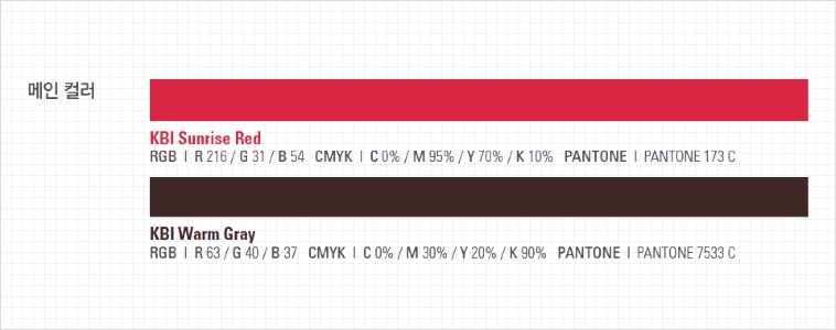
Color
An exclusive color is one of the three most important factors in KBI identity, along with logo and logotype.
It plays a significant role in expressing the image of KBI in various visual materials.
The logo and logotype must be used in KBI Red or Gray only, and in no case should the color or shape be modified without consent.